
Brand colors are one of the most defining aspects of a brand, and your choice of color palette will be one of the most important decisions you make. Extending beyond aesthetics, color registers in people’s memories and is one of the main elements your audience will associate with your brand. It’s a form of communication, both overt and subliminal.
Having a strong understanding of the why of your brand colors, both from a psychological and marketing perspective, will help you make informed decisions. After all, your brand colors don’t live in a vacuum — almost every element of your brand will interact with your color palette. The colors you choose will be present across all of your brand assets, from your logo to your website. If deployed well, your branding colors will help you establish a unified brand identity with the potential to develop strong and long-lasting relationships with customers.
Let’s explore what brand colors are, why they’re important and what steps you can take to develop your own brand’s colors.
What are brand colors?
Brand colors are a palette of colors selected to represent your brand, which includes:
- Primary palette: The main colors customers will associate with your brand. Your primary color is the most seen and used color in your brand.
- Secondary palette: Secondary colors supplement or pair with the primary color.
- Extended or tertiary palette: Reserved for specific brand applications, such as charts and graphs, illustrations and UX/UI. An extended palette enriches and reinforces the primary and secondary palettes.
When chosen and used well, color palettes can establish and uphold brand recognition and equity. Color palettes are not only about the qualities of the individual shades chosen — although those are important — but also about the ways they work together. There are three ways to describe the relationship between two colors in a set:
- Complementary colors are chosen from opposite sides of the color wheel. Picture the Pepsi logo, with blue and red opposing each other.
- Analogous colors are colors that sit next to each other on the color wheel, such as Mastercard’s red and orange circles or John Deere’s yellow deer on a green background.
- Monochromatic colors are varying colors of the same hue, exemplified well by Sprout Social’s stylized leaf logo.

Why are brand colors important?
Brand colors are important because, along with the shape of your logo, they are one of the first and most consistent ways that customers will interact with your brand. Your choices in this process will determine what your logo will look like as well as what your storefront, packaging, website and even business cards will look like. To ensure your brand makes a lasting impression on your customers, you should be consistent and confident with your color selections and applications.
Your brand colors are an important facet of your brand personality. Is your color palette bright, pastel or muted? Does it span the rainbow spectrum, or is it limited to a few select colors? Deployed with purpose and style, your brand colors will build equity and recognition.
The psychology behind brand colors.
Within any given culture, certain colors and color pairings can bring up associations and even elicit emotions. They can have common meanings that run deeper than how they appear to the eye, some of which are conscious and some of which are subconscious. This psychological influence on the consumer can be evidenced by the fact that companies and organizations in a given sector often share similar color characteristics.
For example, many food brands choose warm colors like red and yellow to communicate appetite satisfaction, while others use green to reflect an interest in nutrition or sustainability. Food brands on the sweeter side might use bright pinks to represent playfulness and pops of flavor.
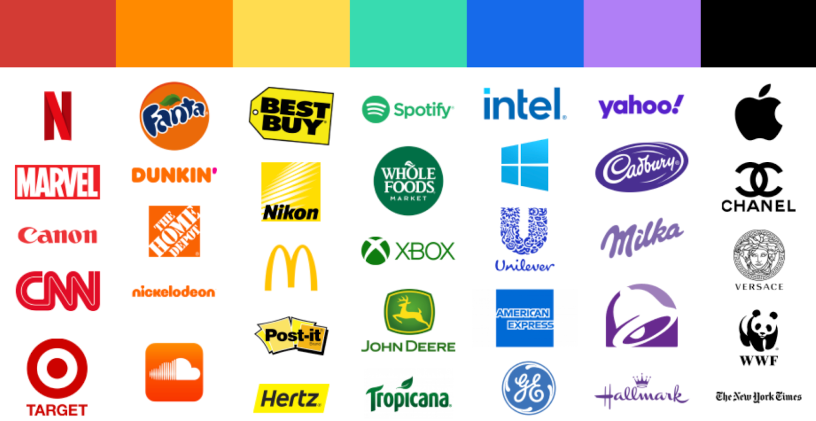
Across industries, blue is the most popular brand color, showing up in 33% of the 100 top brands. Many health care companies and banks use blue to communicate trustworthiness and safety, and green to communicate health and wholesomeness. Some tech companies use blue to evoke feelings of ease and intelligence. The graphic below provides some associations between colors and attributions, particularly in the U.S. and other Western cultures.
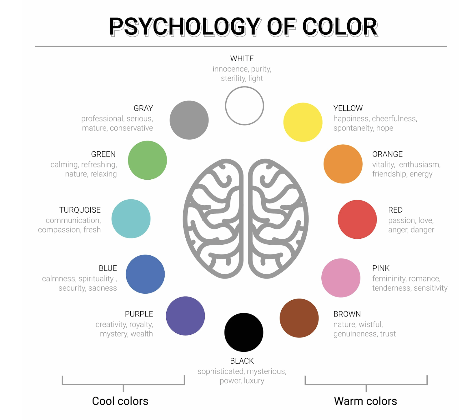
It’s important to note that culture plays a big role in how people interpret color. Whereas white represents innocence and purity in many Western cultures, it represents death and mourning in some East Asian cultures. Black imparts a sense of luxury and sophistication in some cultures but dullness in others.
Even within a given culture, color combinations can have meanings that individual colors don’t. In the U.S., black and orange have their own discrete associations alone, but together, many people will think of Halloween and read the color pairing as spooky.
The point is: It’s crucial to have an understanding of how your target market is likely to respond to the colors you choose. Some of this research can be done at 50,000 feet, but surveys and focus groups can also help you understand reactions to colors and color palettes at a smaller group and individual level. You might be surprised by what you find.
How to choose brand colors in 4 steps.
Step 1: Research your target audience & competitors.
By researching both your audience and your competitors, you will garner a better understanding of your market landscape and how your colors can both establish your brand in its industry and differentiate your brand from its competitors.
For example, as mentioned above, many health care brands and financial institutions choose blue. Your brand may want to position itself squarely within its sector, seeking legitimacy or equity by choosing a color palette common to that industry. Another strategic approach to your colors might be choosing something outside of the norm to stand out or communicate that your organization doesn’t settle for the status quo.
Each approach is valid, and there are ways to blend the approach as well. You might choose a common primary palette but an unusual secondary palette, or vice versa. If industry norms are more muted, you may choose brighter shades.
However you choose to situate your brand within your industry, the decision should be made from a place of knowledge and intention.
Step 2: Establish your brand identity & color palette.
Your brand’s colors should be a reflection of your brand’s identity. Your brand identity is the way your organization presents itself to the public through all communications touch points. It can be found through a self-examination of your mission and values. You can also take inspiration from color experiences that stand out to you in the world.
For example, the Pantone Studio App allows you to extract color codes from any images you capture. The app can scan over 2,000 colors and place them in a shareable palette for you. This means if a leaf you’ve found or a certain color at sunset is exactly what you want, you can capture it and translate it into digital terms. The app even suggests secondary and neutral colors to complement your choice of primary colors.
How would you like your brand to be perceived? A recommended method is to list adjectives to describe your brand, often on a sliding scale from, say, trendy to timeless.
Some other ranges include the following:
- Friendly versus formal
- Rugged versus refined
- Local versus international
Determining your brand identity is an essential step in determining brand colors. A brand wanting to be perceived as more rugged, for example, may choose earthier tones, such as greens, browns and grays, that blend in on a mountain hike. A brand wanting to seem refined may select a neutral palette of blacks and metallics with an accent color or two.
This doesn’t mean your organization’s industry or personality pigeonholes your brand into certain palettes. It just means your color palette is an extension of and channel through which your brand can communicate its personality and thus should be selected with brand identity top of mind.
Step 3: Test your color palette.
One way to determine how your audience will feel about the choices you’ve made is just to ask them. There are several ways you can go about testing your brand color choices, such as:
- A/B testing
- Focus groups
- Application to brand assets
With A/B testing, you advertise online with two different sets of colors or with different proportions of the same colors, and using attribution tools available through online vendors, you can determine which color set received more interaction. If one is better at prompting clicks or conversions, that can inform how you move forward with your color palette.
You can also run focus groups to gather qualitative data about your color choices. This is a more involved option but can yield deep and nuanced data. A focus group should include representatives of your target audience. Through pointed but unbiased questions, you can prompt the group to express how different color sets make them feel about your brand.
Lastly, you need to make sure your colors will work with your brand assets. This means colors not only look good but also work functionally well with your logo, website, presentation decks, packaging and more.
Step 4: Consider color ratio & application.
It’s not only color selection that can and should be part of finalizing a palette; it’s also proportion and application. For example, if you have a palette of blues and greens, it may seem jarring to include a bright orange, and it might not make sense if all colors are shown equally. But it’s smart to have some colors that are used more sparingly while providing contrast, such as for a button on a website or ad. A little pop of a contrasting color can go a long way for aesthetics, functionality and accessibility.
Along with font size, color contrast is an important aspect of legibility. Web Content Accessibility Guidelines, for example, require a contrast ratio of at least 4.5:1 for normal text and 3:1 for large text to be Level AA compliant. Level AAA compliance requires even greater contrast.
You can use contrast testers to determine if your colors can harbor legible text. Your brand guidelines may want to elaborate on how certain colors should be used — for CTA moments or to add contrast, and not to take up more than 10% of a given space, for example.
Once you’ve determined that you have a color palette that fits where you want to be among competitors, expresses your brand personality, has been audience tested and accommodates use cases, you’re ready to show your brand colors to the world.
Hues you can use.
The strategic, creative selection of brand colors contributes to better visibility, communicates something vital about your brand and inspires your target audience to learn more. In a competitive landscape, a distinctive and well-chosen color palette helps a brand stand out. And in the best-case scenario, a color or group of colors can take on a life of their own to be used as shorthand for your brand. Think of T-Mobile pink or Tiffany blue. The colors themselves have become iconic brand identifiers.
In essence, the process of choosing brand colors is not merely a visual exercise but also a strategic decision that influences how a brand is perceived, remembered and understood on an emotional level. It’s worth doing your research, looking for inspiration and taking the time to get it just right.
To connect with branding experts who can help you select, test and deploy a color palette that makes your brand sing, get in touch with Sunup today.